
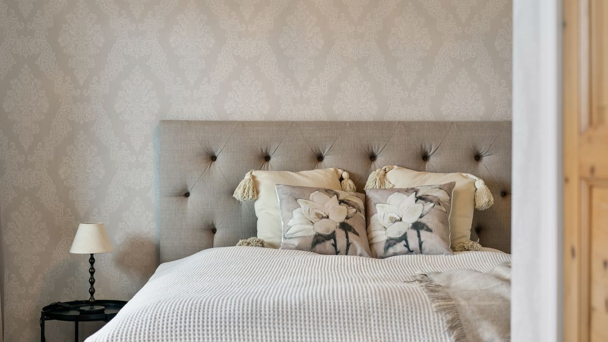
Neutral does not mean empty. A well-built neutral bedroom uses the quiet of low-saturation colour to let texture, light and form do the talking — and that is precisely what makes it restful. Strong colour has its place, but it asks for your attention every time you walk into the room. Neutrals step back. They also bounce light around rather than absorbing it, which matters enormously in a British climate where daylight can be scarce from October through to March. A bedroom dressed in warm whites, soft greys or muted earth tones feels calm on a bright July morning and genuinely cocooning on a dark January evening. That year-round flexibility is why these schemes outlast every passing trend.
There are three broad families to work with, and the most successful bedrooms usually commit to one and simply borrow from another.
A useful rule is to pick three tones from the same family — a light, a mid and a deep — and repeat them at different scales. The eye reads that repetition as calm rather than monotony. Test your choices on a large sheet of paper taped to the wall, and look at them at night under lamplight as well as in the morning, because a neutral will shift considerably between the two.
Without texture, a neutral scheme looks flat and faintly institutional. This is where natural linen comes into its own. Its slightly irregular weave, the subtle slub in the yarn and the way it creases and softens with every wash give a plain colour somewhere to go. A chalk-white linen duvet cover has far more life in it than a smooth synthetic equivalent in the same shade.
Build texture in layers rather than in one bold gesture:
Keep the contrast tonal rather than chromatic. A chalk linen duvet with oatmeal pillows and a clay-coloured throw is far more sophisticated than five different shades competing for attention.
The real advantage of a neutral base is how easily it adapts. Instead of redecorating, you rotate. In spring and summer, strip the bed back: lighter linen in warm white or pale sand, a cotton blanket instead of wool, fresh air through the window and as little on the bed as comfort allows. Come autumn, add a wool throw across the foot, swap cushion covers for taupe or faded olive, and layer a quilt underneath the duvet for extra weight. Nothing is replaced — only rearranged.
Store your out-of-season linens folded in a breathable cotton bag rather than a plastic one, and wash everything before it goes away. Linen that has been put away clean comes out clean, and you avoid setting any body oils or marks into the fibre over the summer months.
Neutral schemes are inherently more sustainable, because they do not date. You are far less likely to replace a chalk linen duvet in three years than you are a duvet in this season's trending colour. Buy fewer, better pieces and the whole room becomes lower-impact by default.
Look for natural fibres — linen, wool, cotton — and for certifications that trace the fibre from field to finished cloth. Avoid synthetic blends that pill, hold odour and shed microplastics with every wash. Care matters as much as purchase: wash linen at 30°C or cooler, line dry where you can, skip the fabric softener, and accept the creases. That crumpled quality is the fibre's character, not a fault, and good linen genuinely improves for the first decade of its life.
Start with the bed, because it covers the largest surface in the room and sets the tone immediately. Choose your linen bedding first, then match wall colour to it, rather than the other way around — it is far easier to find a paint that suits a fabric than a fabric that suits a paint. Keep lighting warm, ideally around 2700K, so your neutrals glow at night instead of turning grey. Then add one grounding piece in a deeper earth tone, and stop there. Clear the surfaces, resist the urge to fill every corner, and let the quiet do its work. A restful bedroom is not decorated so much as edited.

Hi, my name is Anthony kuber. I am artist and fashion designer.
I love to travel and writing blogging.
Your email address will not be published. Required fields are marked *
Software Developer & Writer
Hey, I'm Diva, a developer and writer blending code and creativity. I'm driven by a deep curiosity and a relentless pursuit of excellence. Join me as I craft digital solutions and captivating stories.


